

Shopifyストアを運営していて、こんな「壁」にぶつかったことはありませんか?
- トップページにカテゴリをたくさん並べたいけど、縦に長くなってしまい見栄えが悪い
- ただのスライダーではなく、見出しのデザインや余白も細かく調整したい
- コレクションの画像とは別の、もっと魅力的な画像をアイコンとして使いたい
よくあるスライダー実装の解説では物足りない、デザインの細部にまでこだわりたいオーナー様や開発者のために。
この記事では、Shopifyの標準テーマであるDawnのコードを編集するだけで、月額コスト0円でプロ仕様の「高機能・2行表示コレクションスライダー」を実装する全手順を公開します。
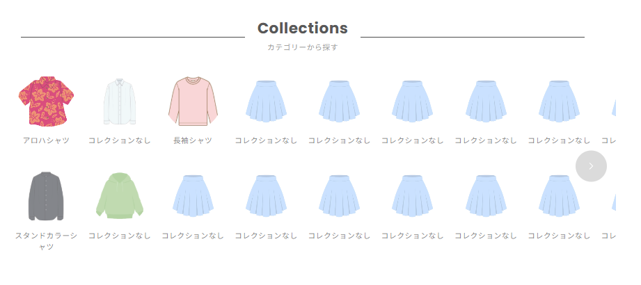
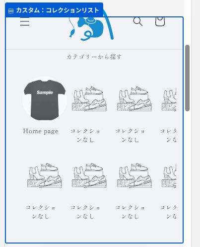
このカスタマイズで実現できること
このセクションを導入することで、テーマカスタマイザーから以下のような詳細な設定が可能になります。
コレクションごとに、表示する画像を自由に上書き設定
- サブ見出し付きの、線で装飾された美しいヘッダー
- PCとスマホで、1行に表示するアイテム数を個別に設定
- セクション全体の余白や、コンテンツの最大幅の調整
- コレクションごとに、表示する画像を自由に上書き設定
ステップ1:カスタムセクションの作成
まず、この機能の本体となるセクションファイルを作成します。
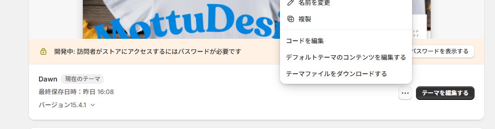
- Shopify管理画面から [オンラインストア] > [テーマ] へ移動します。
- カスタマイズしたいDawnテーマの [...] をクリックし、[コードを編集] を選択します。
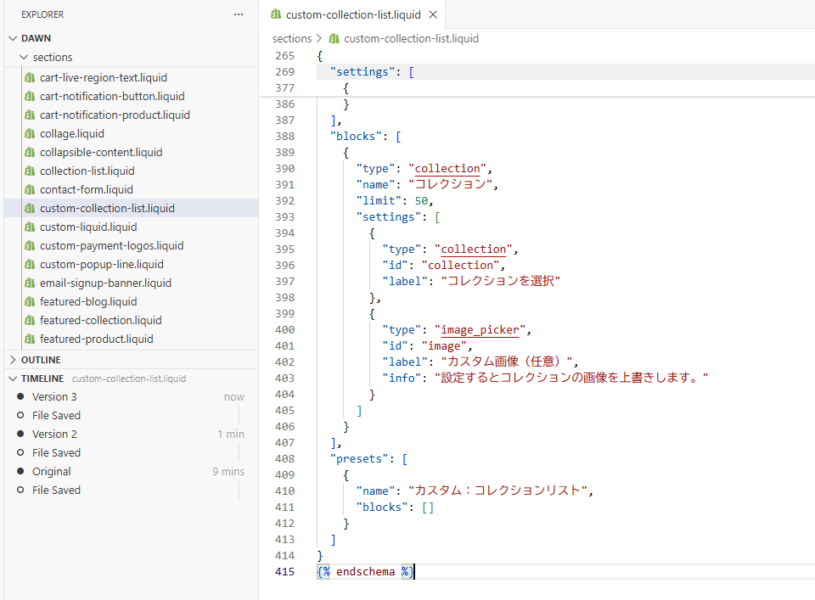
- 左側のファイル一覧から [Sections] フォルダを見つけ、[新しいセクションを追加する] をクリックします。
- ファイル名に custom-collection-list.liquid と入力し、ファイルを作成します。
- 作成されたファイルに以下の最終版のコードをそのままコピーして貼り付けてください。
セクション名の例:custom-collection-list.liquid
{{ 'component-card.css' | asset_url | stylesheet_tag }}
{{ 'component-slider.css' | asset_url | stylesheet_tag }}

<style>
  .custom-collection-list-section {
    padding-top: {{ section.settings.padding_top }}px;
    padding-bottom: {{ section.settings.padding_bottom }}px;
  }
  .custom-collection-list__content-wrapper {
    max-width: {{ section.settings.content_max_width }}px;
    margin: 0 auto;
  }
  .custom-collection-list__header {
    display: grid;
    grid-template-columns: 1fr auto 1fr;
    align-items: center;
    gap: 20px;
    margin-bottom: 3rem;
    width: {{ section.settings.header_width_percentage }}%;
    margin-left: auto;
    margin-right: auto;
  }
  .custom-collection-list__header::before,
  .custom-collection-list__header::after {
    content: '';
    height: 1px;
    background-color: #000000;
  }
  .custom-collection-list__title-wrapper {
    text-align: center;
    flex-shrink: 0;
  }
  .custom-collection-list__title {
    margin: 0;
    font-size: 2.4rem;
    font-weight: bold;
    line-height: 1.2;
  }
  .custom-collection-list__subtitle {
    display: block;
    font-size: 1.2rem;
    margin-top: 0.5rem;
    color: #6d6d6d;
  }
  .custom-collection-list .custom-collection-list__slider-wrapper {
    position: relative;
  }
  .custom-collection-list .custom-collection-list__container {
    overflow-x: auto;
    scroll-behavior: smooth;
    scrollbar-width: none;
    -ms-overflow-style: none;
  }
  .custom-collection-list .custom-collection-list__container::-webkit-scrollbar {
    display: none;
  }
  .custom-collection-list .custom-collection-list__grid {
    display: grid;
    grid-auto-flow: column;
    grid-template-rows: repeat(2, 1fr);
    gap: {{ section.settings.row_gap }}px {{ section.settings.column_gap }}px;
    padding-bottom: 1rem;
  }
  .custom-collection-list .custom-collection-list__card {
    text-decoration: none;
    color: currentColor;
    display: block;
  }
  .custom-collection-list .card__media--circle-wrapper {
    border-radius: 50%;
    overflow: hidden;
    position: relative;
    width: 90px;
    height: 90px;
    margin: 0 auto;
  }
  .custom-collection-list .card__media--circle-wrapper img {
    position: absolute;
    top: 50%;
    left: 50%;
    transform: translate(-50%, -50%);
    width: 100%;
    height: 100%;
    object-fit: cover;
  }
  .custom-collection-list .custom-collection-list__card-title {
    margin-top: 1rem;
    text-align: center;
  }
  .custom-collection-list .custom-collection-list__card-title p {
    margin: 0;
    font-size: 1.2rem;
    line-height: 1.5;
  }
  .custom-collection-list .slider-buttons {
      display: none;
  }
  @media screen and (max-width: 749px) {
    .custom-collection-list .custom-collection-list__container {
      padding-left: 2rem;
      padding-right: 1rem;
    }
    .custom-collection-list .custom-collection-list__grid {
      --items-per-screen: {{ section.settings.mobile_items_per_screen | plus: 0.5 }};
      --gap-width: {{ section.settings.column_gap }}px;
      grid-auto-columns: calc((100% - (var(--items-per-screen) - 1) * var(--gap-width)) / var(--items-per-screen));
    }
  }
  @media screen and (min-width: 750px) {
    .custom-collection-list-section {
      overflow: hidden;
    }
    .custom-collection-list .custom-collection-list__slider-wrapper {
      margin: 0 -50px;
    }
    .custom-collection-list .custom-collection-list__container {
      padding: 0 40px;
    }
    .custom-collection-list__grid {
      --column-count-desktop: {{ section.settings.columns_desktop }};
      {%- assign gap = section.settings.column_gap | times: 1.0 -%}
      grid-auto-columns: calc((100% - (var(--column-count-desktop) - 1) * {{ gap }}px) / var(--column-count-desktop));
    }
    .custom-collection-list .slider-buttons {
      display: flex;
      align-items: center;
      justify-content: space-between;
      position: absolute;
      top: 50%;
      transform: translateY(-50%);
      left: 15px;
      right: 15px;
      pointer-events: none;
    }
    .custom-collection-list .slider-button {
      pointer-events: auto;
      width: 50px;
      height: 50px;
      background-color: rgba(0, 0, 0, 0.2);
      border-radius: 50%;
      color: white;
      border: none;
      display: flex;
      align-items: center;
      justify-content: center;
      cursor: pointer;
      transition: background-color 0.3s, opacity 0.3s;
    }
    .custom-collection-list .slider-button:hover {
      background-color: rgba(0, 0, 0, 0.5);
    }
    .custom-collection-list .slider-button:disabled {
      opacity: 0;
      pointer-events: none;
    }
  }
</style>

<div class="custom-collection-list-section color-{{ section.settings.color_scheme }} gradient">
  <div class="page-width">
    <div class="custom-collection-list__content-wrapper">
      <div class="custom-collection-list__header">
        <div class="custom-collection-list__title-wrapper">
          {%- if section.settings.heading != blank -%}
            <h2 class="custom-collection-list__title">{{ section.settings.heading | escape }}</h2>
          {%- endif -%}
          {%- if section.settings.subheading != blank -%}
            <span class="custom-collection-list__subtitle">{{ section.settings.subheading | escape }}</span>
          {%- endif -%}
        </div>
      </div>

      <div class="custom-collection-list" data-section-id="{{ section.id }}">
        <div class="custom-collection-list__slider-wrapper">
          <div class="custom-collection-list__container" tabindex="-1">
            <div class="custom-collection-list__grid" role="list">
              {%- for block in section.blocks -%}
                {%- liquid
                  assign collection = collections[block.settings.collection]
                -%}
                <div class="custom-collection-list__grid-item" {{ block.shopify_attributes }}>
                  <a href="{{ collection.url | default: '#' }}" class="custom-collection-list__card">
                    <div class="card-wrapper">
                      <div class="card card--standard">
                        <div class="card__inner">
                          {%- liquid
                            assign card_image = block.settings.image
                            if card_image == nil
                              assign card_image = collection.image
                              if card_image == nil and collection.products.first.featured_image != blank
                                assign card_image = collection.products.first.featured_image
                              endif
                            endif
                          -%}
                          <div class="card__media--circle-wrapper">
                            {%- if card_image != blank -%}
                              <img src="{{ card_image | image_url: width: 300 }}" alt="{{ collection.title | escape }}" width="90" height="90" loading="lazy">
                            {%- else -%}
                              {{ 'collection-2' | placeholder_svg_tag: 'placeholder-svg' }}
                            {%- endif -%}
                          </div>
                        </div>
                      </div>
                    </div>
                    <div class="custom-collection-list__card-title">
                      <p>{{ collection.title | default: 'コレクションなし' }}</p>
                    </div>
                  </a>
                </div>
              {%- endfor -%}
            </div>
          </div>

          {%- assign total_slots_pc = section.settings.columns_desktop | times: 2 -%}
          {%- if section.blocks.size > total_slots_pc -%}
            <div class="slider-buttons no-js-hidden">
              <button type="button" class="slider-button slider-button--prev" name="previous" aria-label="Previous">
                <svg xmlns="http://www.w3.org/2000/svg" class="icon icon-caret" viewBox="0 0 10 6" transform="rotate(90)"><path fill-rule="evenodd" d="M9.354.646a.5.5 0 00-.708 0L5 4.293 1.354.646a.5.5 0 00-.708.708l4 4a.5.5 0 00.708 0l4-4a.5.5 0 000-.708z" fill="currentColor"/></svg>
              </button>
              <button type="button" class="slider-button slider-button--next" name="next" aria-label="Next">
                <svg xmlns="http://www.w3.org/2000/svg" class="icon icon-caret" viewBox="0 0 10 6" transform="rotate(-90)"><path fill-rule="evenodd" d="M9.354.646a.5.5 0 00-.708 0L5 4.293 1.354.646a.5.5 0 00-.708.708l4 4a.5.5 0 00.708 0l4-4a.5.5 0 000-.708z" fill="currentColor"/></svg>
              </button>
            </div>
          {%- endif -%}
        </div>
      </div>
    </div>
  </div>
</div>

<script>
document.addEventListener('DOMContentLoaded', function() {
  const sectionEl = document.querySelector('.custom-collection-list[data-section-id="{{ section.id }}"]');
  if (!sectionEl) return;
  const container = sectionEl.querySelector('.custom-collection-list__container');
  const prevButton = sectionEl.querySelector('.slider-button--prev');
  const nextButton = sectionEl.querySelector('.slider-button--next');
  if (!container || !prevButton || !nextButton) return;

  const updateButtons = () => {
    if (window.matchMedia('(min-width: 750px)').matches) {
      const scrollLeft = Math.ceil(container.scrollLeft);
      prevButton.disabled = scrollLeft <= 0;
      nextButton.disabled = scrollLeft >= container.scrollWidth - container.clientWidth - 1;
    }
  };
  prevButton.addEventListener('click', () => container.scrollBy({ left: -container.clientWidth, behavior: 'smooth' }));
  nextButton.addEventListener('click', () => container.scrollBy({ left: container.clientWidth, behavior: 'smooth' }));
  container.addEventListener('scroll', updateButtons);
  window.addEventListener('resize', updateButtons);
  updateButtons();
  if (Shopify.designMode) {
    sectionEl.closest('.shopify-section').addEventListener('shopify:section:load', updateButtons);
  }
});
</script>

{% schema %}
{
  "name": "カスタム:コレクションリスト",
  "tag": "section",
  "class": "section",
  "settings": [
    {
      "type": "text",
      "id": "heading",
      "default": "Collections",
      "label": "見出し"
    },
    {
      "type": "text",
      "id": "subheading",
      "default": "カテゴリーから探す",
      "label": "サブ見出し"
    },
    {
      "type": "header",
      "content": "レイアウト設定"
    },
    {
      "type": "range",
      "id": "content_max_width",
      "min": 600,
      "max": 1400,
      "step": 20,
      "unit": "px",
      "label": "コンテンツの最大幅",
      "default": 1200
    },
    {
      "type": "range",
      "id": "header_width_percentage",
      "min": 50,
      "max": 100,
      "step": 5,
      "unit": "%",
      "label": "見出しエリアの幅",
      "info": "コンテンツの最大幅に対する見出しエリアの幅を割合で指定します。",
      "default": 90
    },
    {
      "type": "header",
      "content": "コレクションリスト設定"
    },
    {
      "type": "range",
      "id": "columns_desktop",
      "min": 3,
      "max": 12,
      "step": 1,
      "default": 8,
      "label": "PCでの1行あたりの表示数"
    },
    {
      "type": "range",
      "id": "mobile_items_per_screen",
      "min": 3,
      "max": 8,
      "step": 1,
      "default": 5,
      "label": "SPでの1行あたりの表示数",
      "info": "設定値に0.5を加えた数で幅が計算されるため、自動的に次の列が見切れて表示されます。"
    },
    {
      "type": "range",
      "id": "column_gap",
      "min": 0,
      "max": 100,
      "step": 2,
      "unit": "px",
      "label": "列の余白",
      "default": 16
    },
    {
      "type": "range",
      "id": "row_gap",
      "min": 0,
      "max": 100,
      "step": 2,
      "unit": "px",
      "label": "行の余白",
      "default": 16
    },
    {
      "type": "color_scheme",
      "id": "color_scheme",
      "label": "配色",
      "default": "scheme-1"
    },
    {
      "type": "header",
      "content": "セクション余白設定"
    },
    {
      "type": "range",
      "id": "padding_top",
      "min": 0,
      "max": 100,
      "step": 4,
      "unit": "px",
      "label": "上部パディング",
      "default": 36
    },
    {
      "type": "range",
      "id": "padding_bottom",
      "min": 0,
      "max": 100,
      "step": 4,
      "unit": "px",
      "label": "下部パディング",
      "default": 36
    }
  ],
  "blocks": [
    {
      "type": "collection",
      "name": "コレクション",
      "settings": [
        {
          "type": "collection",
          "id": "collection",
          "label": "コレクション"
        },
        {
          "type": "image_picker",
          "id": "image",
          "label": "カスタム画像(任意)",
          "info": "設定しない場合はコレクションの画像が使用されます。"
        }
      ]
    }
  ],
  "presets": [
    {
      "name": "カスタム:コレクションリスト"
    }
  ]
}
{% endschema %}
ステップ2:動作確認と運用のコツ
実装が完了したら、テーマ編集画面のテンプレートにセクションを追加してください。
画像の工夫: コレクション自体の画像がアイコンに不向きな場合は、ブロック設定から「カスタム画像」をアップロードして上書きしてください。
PCでの見せ方: 1行あたりの表示数を「8」や「10」に設定すると、大手モールのようなプロ感が出ます。
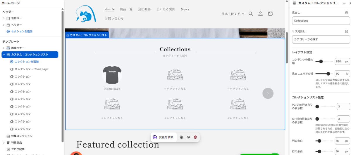
スマホの見せ方: mobile_items_per_screen の設定値に自動で 0.5 を加算して計算する仕組みにしています。これにより、ユーザーに「横に続きがある」ことを直感的に伝える「見切れ表示」が自動で完成します。
まとめ
トップページの「ナビゲーション」は、ストア接客の要です。
Dawnのポテンシャルを最大限に引き出し、標準機能を賢く拡張することで、「表示速度」「コスト」「デザイン」のすべてにおいて妥協しないストア作りが可能です。
アプリの月額費用を抑えたい、もっと自由なレイアウトにしたいとお考えの方は、ぜひこのカスタマイズに挑戦してみてください!
やっぱり1行にしたい、バランスを調整したい、という方は適宜CSSを整えてください。
また、Dawn以外のテーマでは動作が保証できませんので、ご了承ください。
カスタマイズのご相談はこちら
自社ストアに合わせた微調整や、他テーマへの導入でお困りの方はお気軽にお問い合わせください。
当ブログ お問い合わせフォーム
https://yurufuwacat.com/question/
MottuDesign公式HP CONTACTフォーム
https://mottu-design.com/contact/